8/29/2025
When in Doubt, Draw It Out
Stephanie Saccomano

At one point in my life I wouldn’t have thought of myself as a numbers person, and the idea of data, plans and charts would recede my attention into the abyss. But lately as I’ve navigated into more production planning and R&D scenarios, I’ve come to appreciate and even enjoy the complexity of the finer details. I’ve also learned that when you’re trying to summarize a plan or an idea, nothing shuts down a conversation faster than overloading people with numbers and equations.
“If you plant 10,500 4 in. in Week 12, get a trim in over Week 16, assuming you started with a 10-cm input, maintain your pH at 5.5 and achieve a growth rate of 1 cm per week, you’ll make your ship window. This factors in a shrink of 5%.”
Numerical overload. So when we’re having an ad-hoc conversation, I’m often scribbling along as we discuss to help keep it all straight and facilitate a recap. Be it a quick sketch in the notebook or doodles on the whiteboard, visuals help translate the number soup into something everyone can follow. This is helpful for newer growers and veteran production leads alike. Taking it beyond the ad-hoc and pen sketches, there are three helpful charts we’re using often to help keep us all on the same page: Before crops hit the ground, while they’re growing and after they’re out the door.
What’s the plan?
We have a giant poster hanging on the wall in our grower office. We call it the Grower Planning Sheet or the “GPS” (get it?). A crop schedule in the form of a Gantt chart, it’s our go-to for answering questions like, “When should I propagate or plant this?” “When is this supposed to ship?”
The beauty of the Gantt is how simple it is to read. It lets you quickly scan for overlaps, labor pressure points or production gaps. We add notes or tasks by week, such as, “Don’t trim after this week!” or step out a preventative spray plan. It untangles crop calendars into a visual roadmap that the whole team can use.
Now, is it perfect? Of course not. It’s a plan, not a prophecy. Life happens and can throw all sorts of variables your way. But when things veer off course, the GPS gives us a baseline to field changes against. It helps us pivot. Throughout the year, we’re reviewing and adjusting so we can continuously improve.
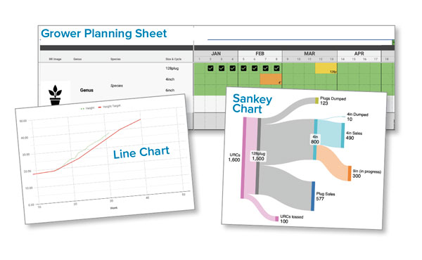
Am I on track?
What I love about this is how it builds a story over time. Our growing team tracks their crops continuously (typically substrate pH, EC and height) and compares the numbers against weekly targets. When we feed that data into a line chart (with our goal range clearly marked), the wall of numbers suddenly becomes actionable. And instead of one point of data, you can easily see your new information folded in relation to its past as well as similar crops. As each week’s data gets added, the chart auto-populates and starts to tell a visual story.
“I’m a few centimeters behind. pH has been drifting for the past three readings and temps are trending lower than usual.” Great! Now launch into further exploration and correction. Even better, we can factor in last year’s data for comparison or add more variables, such as light or irrigation volume. Once you’ve built the template (arguably the most tedious part), it’s easy to duplicate year over year. And suddenly you’re not just tracking plants, you’re reading them.
How did that go?
Of all things, this was inspired by a financial management app. I wasn’t even thinking about plants; I was trying to budget. The app uses a Sankey chart to show where income flows into multiple expense categories and eventually it clicked: How great would it be to really see my flow with crop inventory? For simple cycles, it’s more work than it’s worth, but for some of our schedules that feed multiple outlets, it tells the story and we can clearly understand which stages or varieties are the weakest link. It’s a picture of distribution dynamics with clarity that spreadsheets alone can’t provide. We can easily show where the product went in entirety. And when you’re trying to review a two-year crop track, a visual like this cuts through the complexity.
You don’t need to be a whiz kid to use these tools (I most certainly am not), and you don’t need fancy software or a background in data to make this work. With a little effort up front, these tools will keep working for you, saving time, surfacing issues sooner and helping the team stay in sync. Still unsure where to start? Start small. Sketch out a timeline. Track one metric. Build one simple chart. Because once you start turning numbers into something you can see, you’re not just making a plan, you’re building a system that grows with you. GT
Stephanie Saccomano is Production Technical Lead for Qualitree Propagators in Rosedale, British Columbia, Canada.